In this assignment it is set out to show that we have command over colour within the image in photography. That we are able to use and find different colours in deliberate relationships. There were 4 areas to look at and work in for this assignment, there is complementary colours, similar colours, and contrasting colours and then colour accent (spot) whilst keeping the image together. With complementary colours it was about using colours that complement each other and these colours are found facing each other in the colour circle such as blue and orange or red and green. Then we have similar colours like red, orange and yellow these colours are found next to each other and can be class as warm colours so with similar colours there can tend to be a warm range and a cool range in colour. Contrasting colours these are colours that do not blend well together but when used right can have a very strong contrast which leads to the image to be very eye catching and draws your attention to it. These colours are spaced a third of the way around the colour circle such colours as blue and red. For a colour accent or spot, is when you have a small area of a colour sat in and against a much larger background colour so as to appear as a spot or accent of colour within the image.
I do have to admit after taking pictures for quite a while I found this assignment the hardest 1 of all. I don’t know why but I found it hard to see it the way it was described, sometimes but hopefully after going through the course materials over and over especially when my computer crashed and I lost some of my work I was able to start a fresh and look at it from a little bit of a different angle.
In the range of images that I have done for this assignment they come from a range of still life, landscapes, macro shots and those moments when you are glad you have your camera with you because you never know if it would happen again. So I needed 4 images for each of the 4 colour relationships making a total of 16 images, here they are.
Colour Harmony through Complementary colours.
The four images for this topic are.
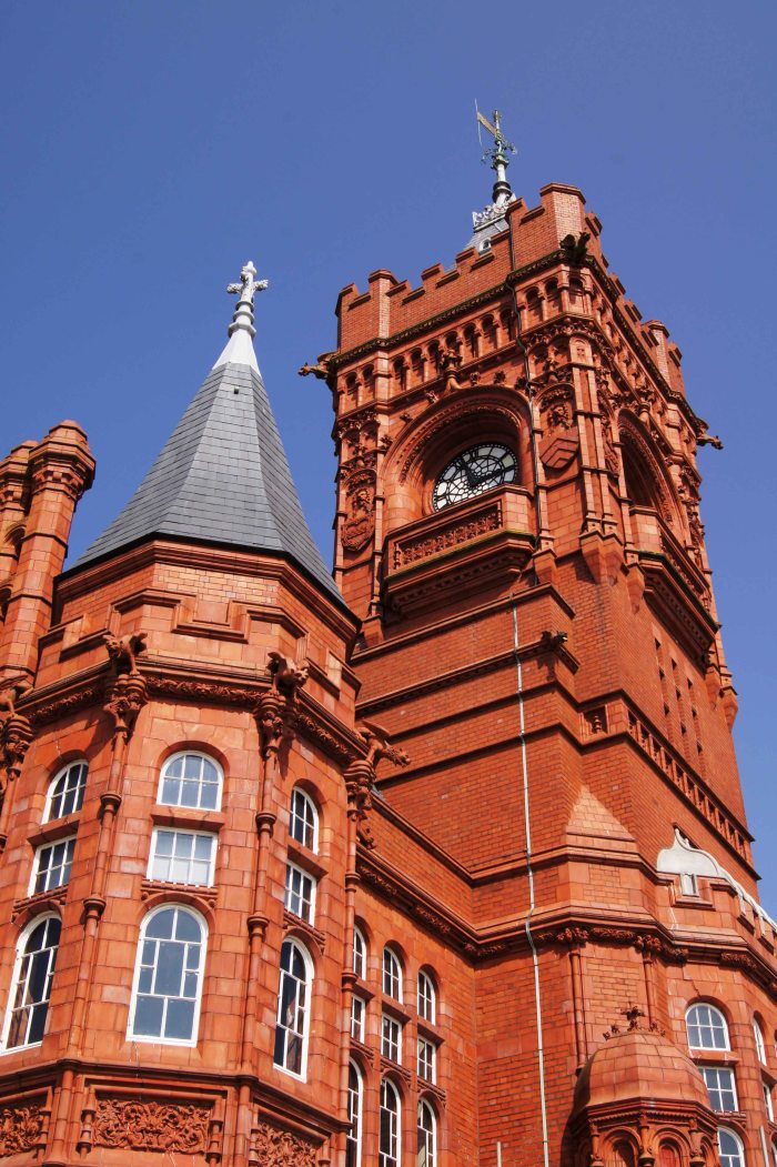
- The blue sky with the orange brickwork of an old collage.
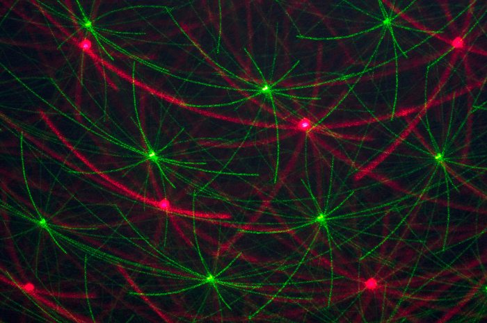
- Red and green laser movement.
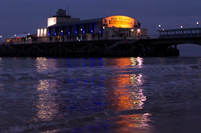
- Orange and blue pier lights and reflections
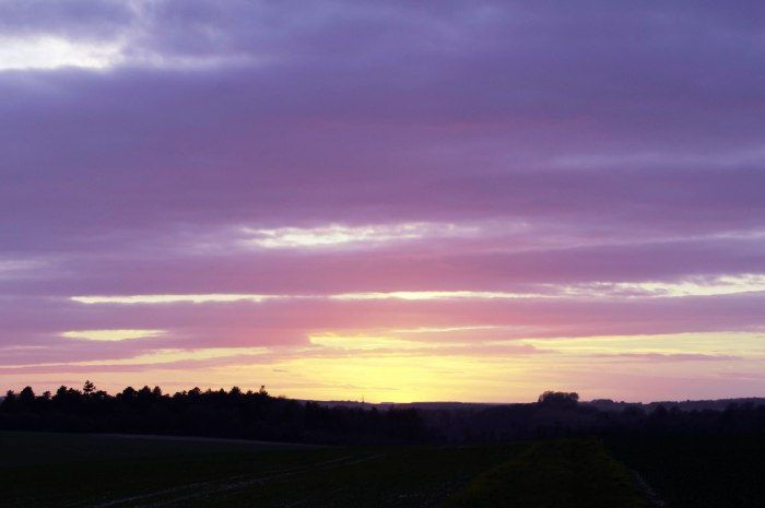
- Yellow and violet coloured sunset.
With the image of the old collage I had in my note book that I needed blue and orange but had forgot to put the amount of each that was needed so I ended up with more orange than I would have liked to have had, but to crop the image so as to give the values I would like, would leave the image in an unpleasing image that is why I left this as it is.
The red and green lasers this was the easy one, once I had found something a little different from any other images that I have seen. So using a disco laser light system I have I was able to slow the lasers down then making sure I had a 50-50 split in the view finder I than did a slow shutter speed of a second whilst being hand held to grab the light trails of the laser.
The image of the Bournemouth pier lights was my correction to the last blue and orange. I went to Bournemouth to see some family and went for a walk along the beach, this is when I looked over at the pier and saw the way in which the lights lit up the pier but also their reflections across the water towards me. I did double check the white balance on the camera to make sure I had it right, which I feel I did as the street lights on the pier are white which is how they appeared to look instead of the orange glow that you often see with night street photography.
The last image in this set the yellow and violet sunset was a by chance shot, out walking the dog I noticed that the sun was setting so just looking up saw that the sun had almost gone but was leaving me this lovely sunset with the darkish clouds and the last bit of the sun showing through on the horizon. I also tried to get the right value of 1:3 yellow: green.
Colour harmony through similar colours.
The four images I have used in this area are.
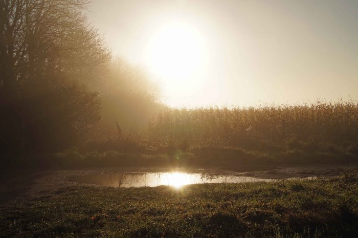
- A misty sunrise on an early misty morning.
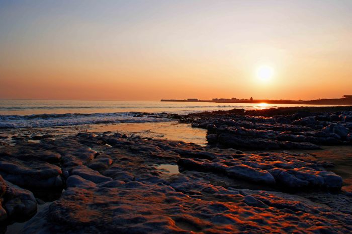
- Another sunset this time over a bay.
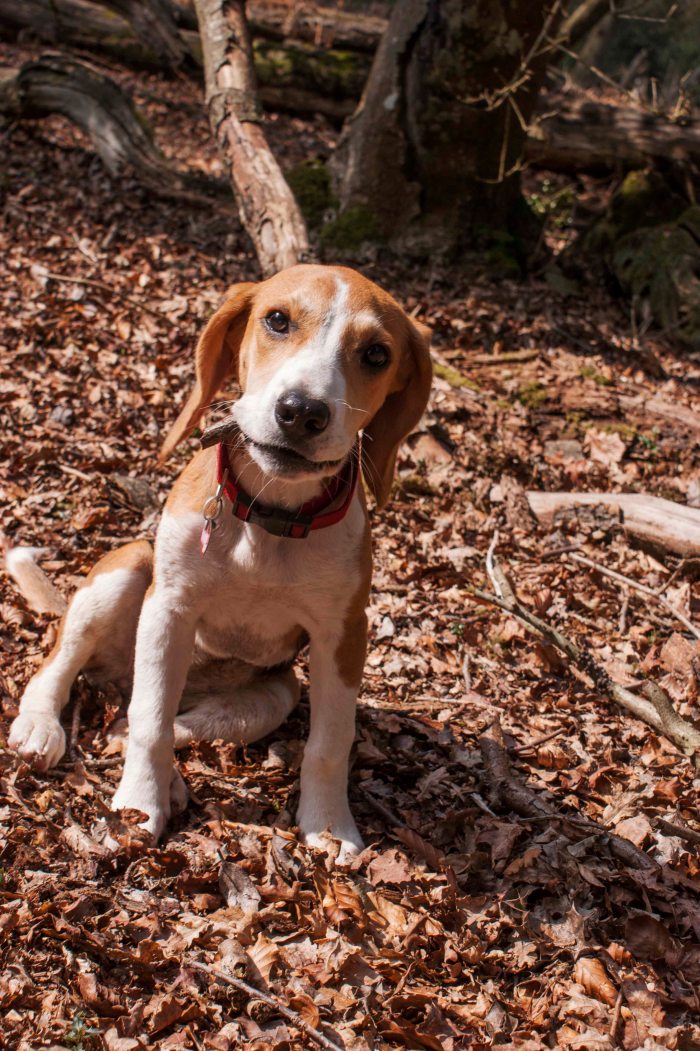
- A puppy in the new forest.
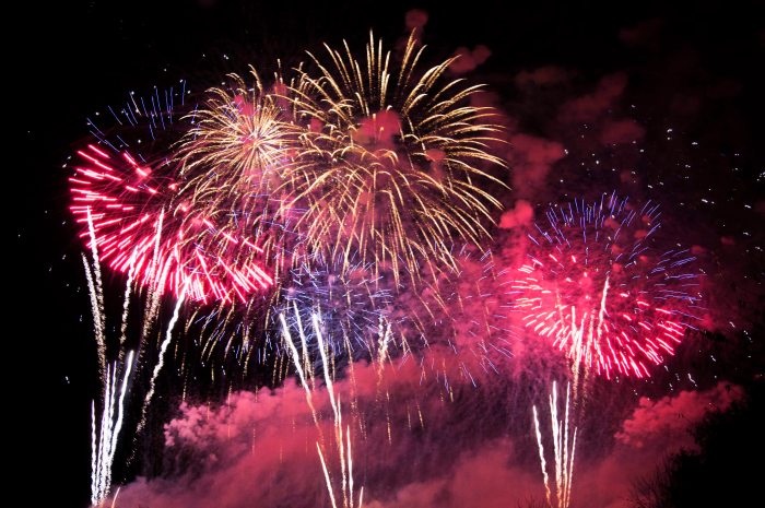
- The ending of a fireworks display.
A misty sunrise I chose to use this image because of where the colour is so similar through the whole image the main colour is a light orange colour hinting to the yellow and a bit of brown.
Sunset over the bay this image is chosen quite simply because of the orange glow that is cast over everything as the sun was setting so pretty much everything has an orange tint making all the colours blend together.
A puppy this is my beagle and a naughty girl she is! I loved this image in the new forest with all of the dead leaf litter (brown colours) the tricolour of the puppy and chewing on the little bit of stick. The colours all blend together so well, being that it is mainly the brown colours all the way through.
The ending of a fireworks display this image I chose because of all the warm colours that are in there plus when you see fireworks a lot of people will think of the bonfire and keeping nice and warm next to it.
Colour contrast through contrasting colours.
Four images I have chosen are.
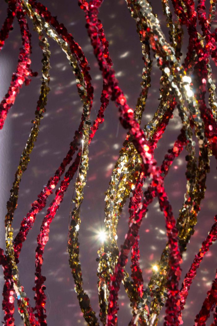
- Red and yellow sticks.
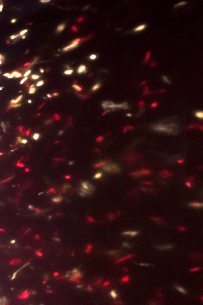
- Red and yellow reflections.
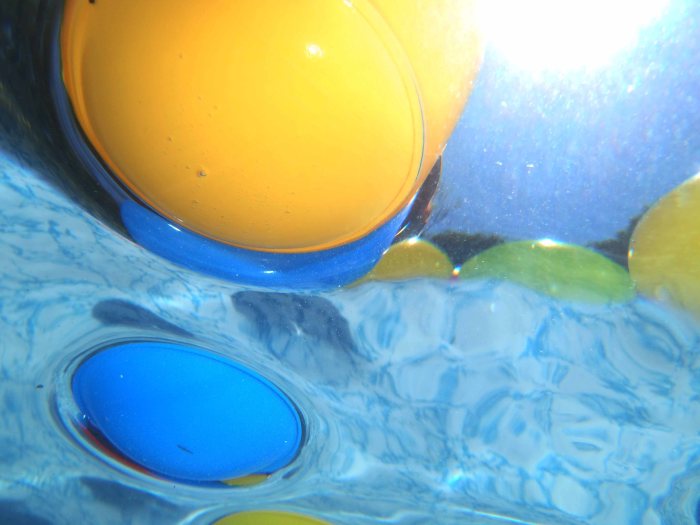
- Blue and yellow balls underwater.
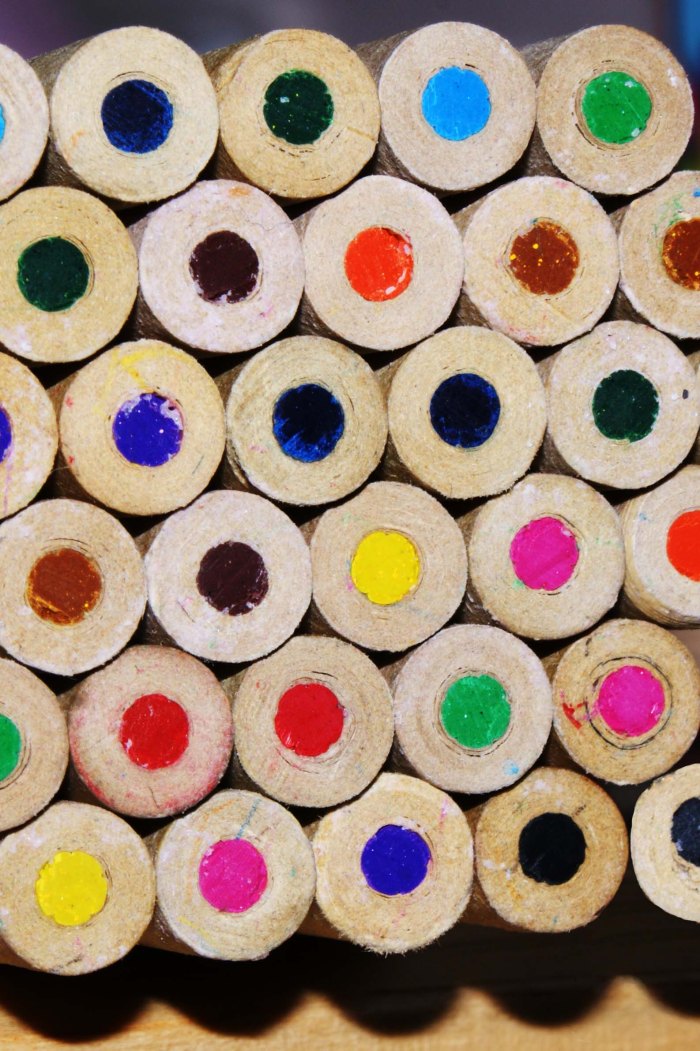
- Colouring pencils.
In the red and yellow sticks image, I was out to capture that contrast of the red and yellow and show how it can work together to make something that is pleasing to look at but also is used very often especially at Christmas time. I felt that with the waviness of the sticks it brings movement to the image.
Red and yellow reflections was just a little something I saw in the background so after moving around a little I used a darker wall and got the image of the sparkle reflections on the wall. I did notice that the yellow mainly appears at the top and the red mainly at the bottom but I feel that this adds to the fact that these two colours are a contrast of each other and is something different.
Blue and yellow balls taken underwater again I wanted the image to be different it was the first time I had tried underwater photography and was only using a compact camera instead of my DSLR. I had to admit I was impressed with how the compact camera did and felt that the images were as good as they could be. In this image I just liked the way in which it all looked underwater and how you can see the things on top of the water which were not in view under the water.
Colouring pencils this image is an idea from an old photography magazine I had laying around in which they shined a light down some coloured straws to get a colour cast. I thought that if I used a pack of colouring pencils and shined a bit of light at the ends then that would show off the colours giving a contrast of colours because of there being so many of them. I do feel that it did work and the pattern also helps by making you look across the entire image.
Colour accent using any of the above combinations.
These are my four images for an accent using any combination.
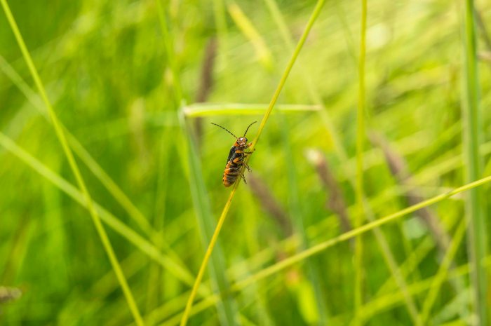
- A soldier bug in the meadows.
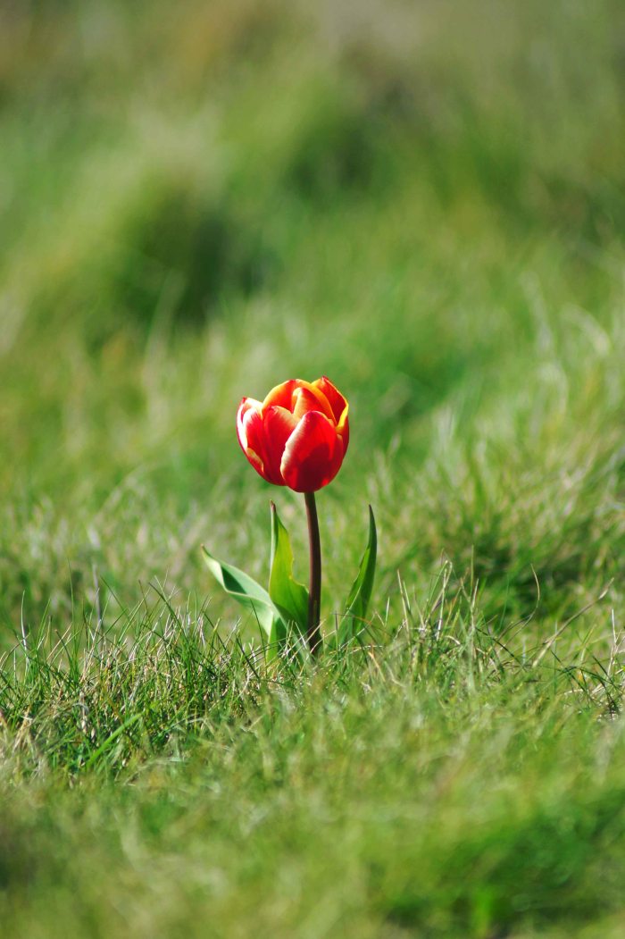
- A lone tulip on a cliff.
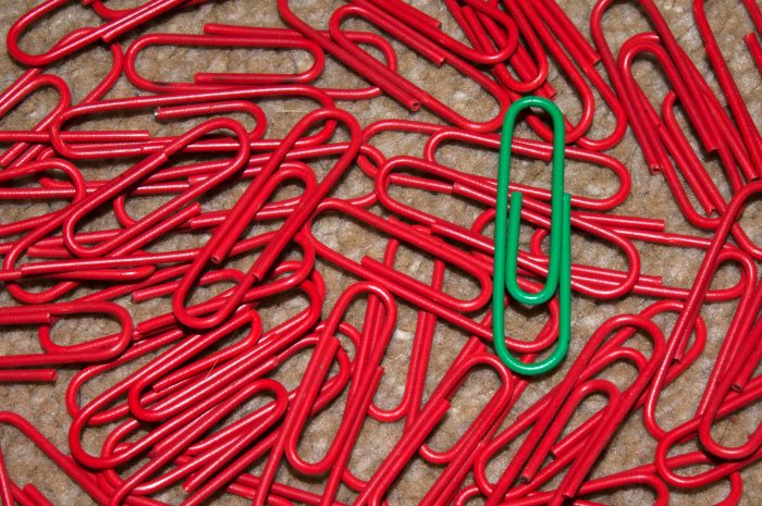
- An ill looking red paperclip!
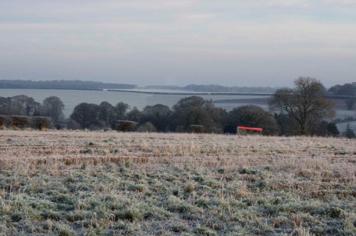
- Red bus in the countryside.
Soldier bug in the long grasses of the meadow I wanted to include this image as it is one I think is spot on for this topic. I just love how this orange bug is sat on the long grass looking at the camera with all the green grass in the background and all of the diagonal lines just help this image to fit in together perfectly.
The lone tulip I found sat all on its own on the side of a cliff face it was near the top on a steep slope just before the cliff face drops, it was a surprise to see it there but also intriguing to how it got there. It is also the way in which the red stands out from the green grass it just grips you and pulls you in.
An ill looking paperclip, well a green paperclip amongst a sea of red paperclips, this idea came to me whilst staring at the pot of paperclips thinking what can I do for colour accent I then remembered an image from the course book showing a colour accent, it was green fields and the red roof of a building an aerial shot. That is when I noticed that were quite a lot of red paperclips but so many of the green and that was the deciding thought on what to do and the results I think are not too bad, when I look at the image I do have this feeling that a smaller green paperclip would have done better, I was just making do with what I had at hand.
The red bus in the countryside this was a by chance moment I had stopped in a small layby on a busy road going through Salisbury plain, I stopped because I wanted to get a picture of the frozen fields across the plain, I had just taken a couple when I noticed the bus coming through the shot it was then I noticed the flash of the red and thought that is what I have been looking for my last shot for this assignment so twisting slightly managed to get this shot just before it dropped down the hill. So not the best landscape picture in the world but does fit the purpose of this assignment and I got cold doing it all part of the fun.
My conclusion.
I started off by not fully understanding what was ment by this topic and assignment in colour but now that I have reached the end of it I do feel that now I can understand how colours can add feeling to an image, also that with colour you can control it quite a lot in just the camera by just changing the speed or aperture to darken or lighten colours, then with white balance playing with it can add a blue or orange tint to your images. There is also the fact that adding filters to the camera or to the digital image through a photo editing software we can change the image. So it is important to know what it is you want to see in your images but also knowing how you want it to feel to yourself and your audience.
