Judging Colour Temperature 2

This exercise is a continuation from the last exercise with some added extras firstly looking at the last images and seeing if there is any correction needed to the images, do we need to add any cooling or warming up of the images so as to take any blue or orange tinting out of the images. The second part is to take a new series of images still in one in sun light, one in the shade and one with the sun at a low point, but when we do, do the images take one with the white balance set as daylight then one set in the shade setting in the white balance and then the third one to be set as auto in the white balance so a total of nine images then we can compare which of the sets we feel make the image work.

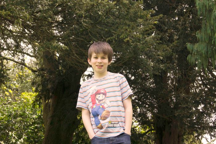
So as I said the first part to look at the three images from the last exercise. The first image was taken in direct light with the white balance set to daylight.

SONY DSC

So as we can see the image is in a lovely and bright colour and skin tones are as they should be making this image look just right for what it should look like. I think that trying to have any kind of tint be orange or blue would ruin the image from what it is at.

SONY DSC

The second image was taken in the shade again with the setting in the white balance set to daylight as per the instruction for the exercise.So as we can see the image is ok but the problem with the image is that it looks like the colour is not quite right and it is with this image that I feel that it could do with some correction by adding a warmer colour to it so as to make the skin tones appear to be brighter.

 SONY DSC

This is the shade image which I decided to do a quick edit to see if what I said about the image would work and as you can see I think it is a very big improvement the image is brighter and the boy looks better to so warming the image up was the right way to go.

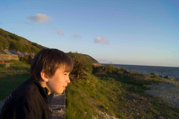
Now with the third image it was taken when the sun was setting at a beach and I really liked it the setting was set to daylight as instructed.

SONY DSC

Now I feel that the way this image colour is, is the right way for this image as the feeling in it is right and adds feeling to it. I think that if you were to take the orange glow away from it then it will not feel the same or look as good and adding shade to the image would be wrong.

Now on to the second part of this exercise which is to take 9 images, I will start with the images that were done in direct sun light.

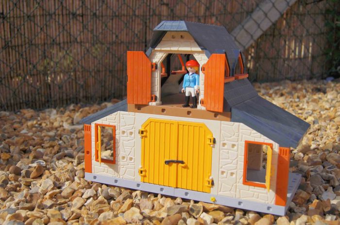
SONY DSC

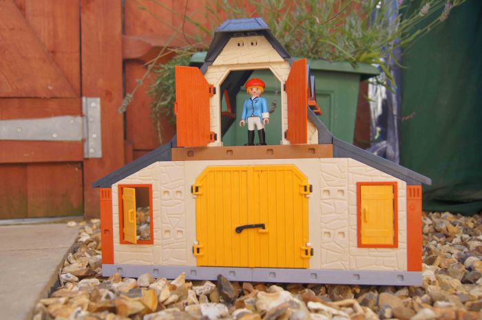
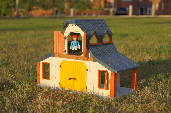
This image is in direct sunlight and white balance set at daylight setting.

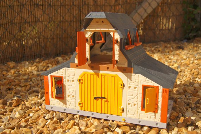
SONY DSC

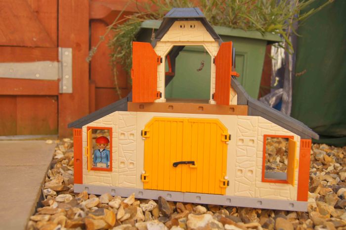
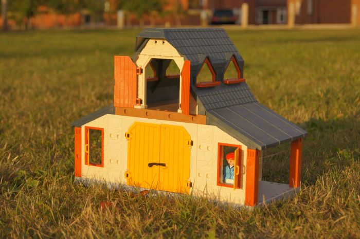
This image is in direct sunlight but now the white balance is set to the shade setting.

SONY DSC

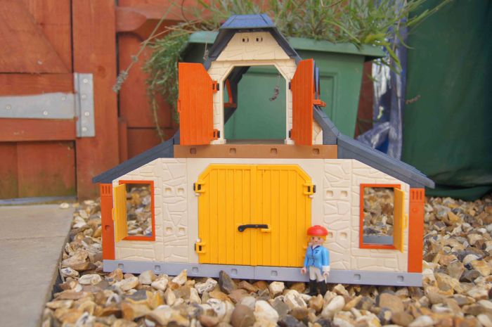
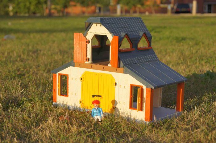
And this image has the white balance set to automatic with direct sunlight.

While looking at these three images of the play farm in direct sunlight I found it quite hard to really see any difference between the automatic white balance and the daylight white balance setting. When you have both of the images of auto and daylight side by side you can see that the colours are just that little bit brighter and crisper in the daylight setting than that of the automatic setting. Whereas with the shade setting you can see that there is an orange tint to the walls of the play farm. So when it comes down to which is the better image I would have to say that the daylight setting is the best image out of this set as the colours are crisp and clear and the look is as it should be.

Now I did the same as the last set of images but instead of direct sunlight I found a nice shady spot to take the three different settings.

SONY DSC

This image is in the shade with the camera set to daylight within the white balance.

SONY DSC

Now this image is was taken with the white balance set to shade whilst in the shade.

SONY DSC

This image has the white balance set to be automatic whilst the subject was in the shade.

Whilst I look at these three images I am thinking that they all are fine admittedly there is a slight orange hint to the shade setting and the daylight setting looks slightly darker than the others. There is one that fits well for what the image should look like and that is the image with the automatic white balance setting and I feel that this is because the automatic setting would have made its setting towards the shade setting but altered the value of the setting, which is something that I did not do to the settings as I wanted to keep the settings to be level. Now with all this in mind then, if I was to take the shot again then I would have to use the shade setting but because the image is too warm with the shade setting at base level then I can lower the value and therefore give the colour correction that the image would need.

Now I move on to the third set of images which have been done with the light at a low point in the sky (sunset), so the subject is in direct low level sunlight and again the images will be with the camera set to daylight, shade and automatic for the white balance but like before keeping all other settings the same all the way through the series of images.

SONY DSC

So here we are with the first image of the set and it is with the camera white balance set to daylight nice long shadows and a slight tint of orange.

 SONY DSC

So my second image of the low sun with the camera white balance setting at shade.

Now for the final image in this set and exercise.

SONY DSC

So as this is the last image of this exercise it leaves it to be the automatic white balance with the sun setting behind and to one side of the camera.

Whilst looking at what the images look like I am finding it hard to spot much of a difference between the daylight and automatic setting but find that both are very similar although the automatic setting just seems to be that little bit better than the daylight setting. The shade setting is just too much orange for this subject but given the right subject I feel that all types could work but for this one I would have to say that the automatic setting just wins.

I do feel that if you were to increase or lower the value of the white balance then you would be able to make all images look better when choosing the right white balance setting to use. I say this because we have only just looked at three different settings for white balance, my camera a Sony alpha series has nine different settings that are able to be used for all different light settings, from daylight, shade, automatic, fluorescent, incandescent, cloudy, flash and then there are just a couple of different custom modes. So I feel that if the lighting situation fits any of the above situations then by choosing that setting and adjusting the value higher or lower then we will always get the best image possible, there are also times where there is not time to adjust the white balance so this is when the automatic setting can come into play and help us out by doing its own adjustments to give us a reasonable image.
Judging colour temperature 1

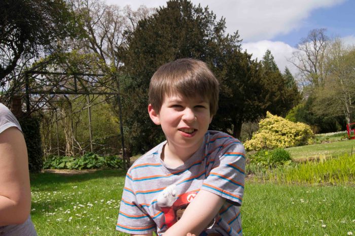
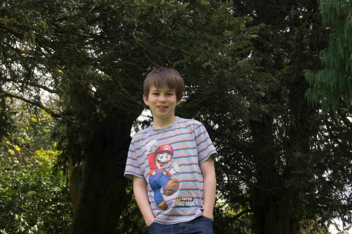
This is a nice little exercise to start us off into the world of colour temperature. I have taken 3 images of my son at 2 different times but in 3 positions, 1 is in lovely sunlight with the sun at its highest in the sky, the second about 10 minutes later but this time in the shade of some trees, the third image was taken a bit later on as the sun was setting. All of these images were taken with the white balance set to daylight/sunlight setting.

Image 1 was set as I had said out in the open with the sun at its highest position and here is the image I got from it.

SONY DSC

So as we can see the image is nice and bright as you can tell from my son the sun was very bright, the colours are looking fab and the clouds are a nice colour too.

I then got my boy to walk over and into the shade so instead of changing the white balance to shade I kept it on daylight and this is the image that came from it.

SONY DSC

So the image has gone darker than what I thought it was there is also a blue shade in the skin colour and an overcast off the greens showing on the skin.

Now image 3 this was taken as the sun was setting and all the white balance settings still set to daylight and not sunset and it was a really nice sunset to enjoy watching it disappear.

SONY DSC

This is the third image and as you can see there is a real nice warm glow in the image.  The skin tone has an orange glow to it which I feel  adds a great feeling to it.
Measuring Exposure

This exercise is to take up to five exposures of a subject one of them being measured as the best exposure for that shot then there should be an image that is one stop darker, half a stop darker, measured exposure, half a stop lighter and then one stop lighter. Once this is done to look at the images and decide whether the measured image is as you would expect it to be, what it is you wanted and then which if any of the other exposures are acceptable.
I thought that because of my last lot of assignments and exercises that I have done for this topic of light I will try and make sure that each exercise/ assignment has a topic to stick too.
So with this in mind for this first exercise I choose to use objects that are on display in homes, at least they are on display in my house.

1 stop darker lion
1 stop darker.

half stop darker lion
Half stop darker.

measured lion
Measured shot.

half stop lighter lion
Half stop lighter.

1 stop lighter lion
1 stop lighter.

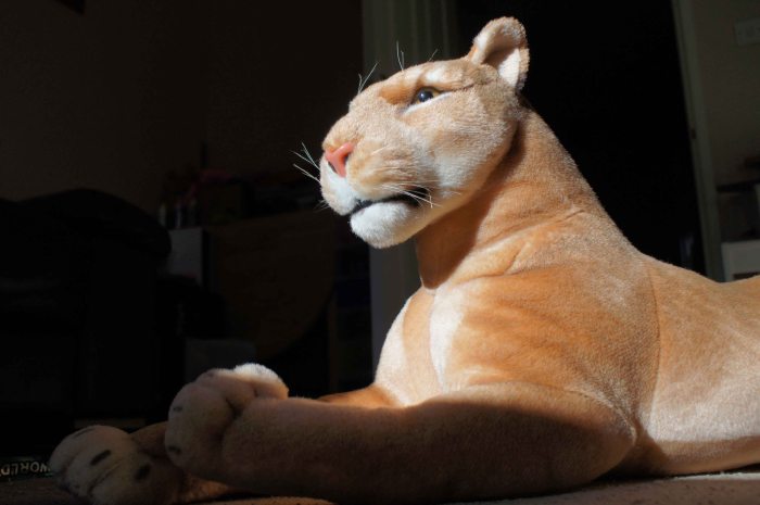
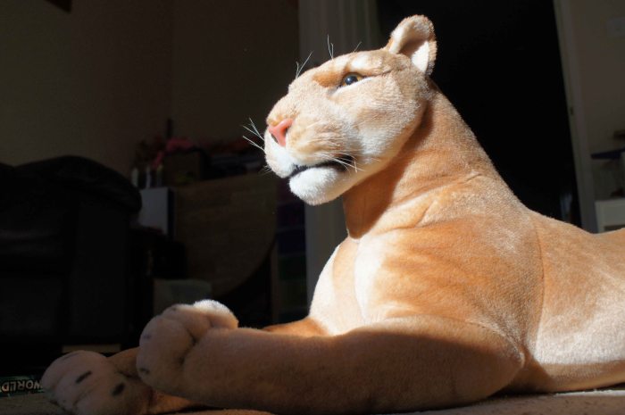
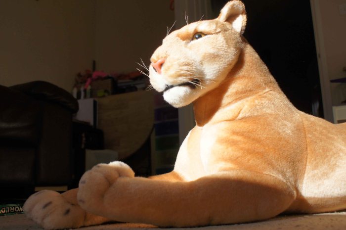
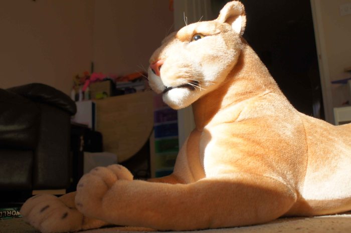
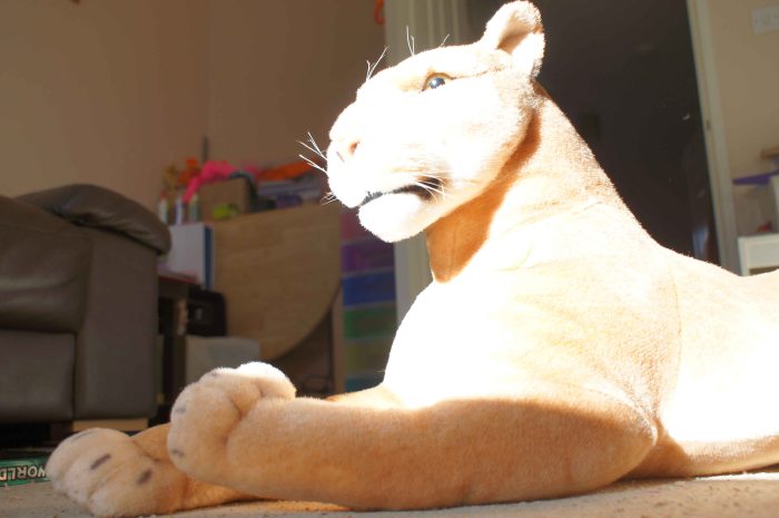
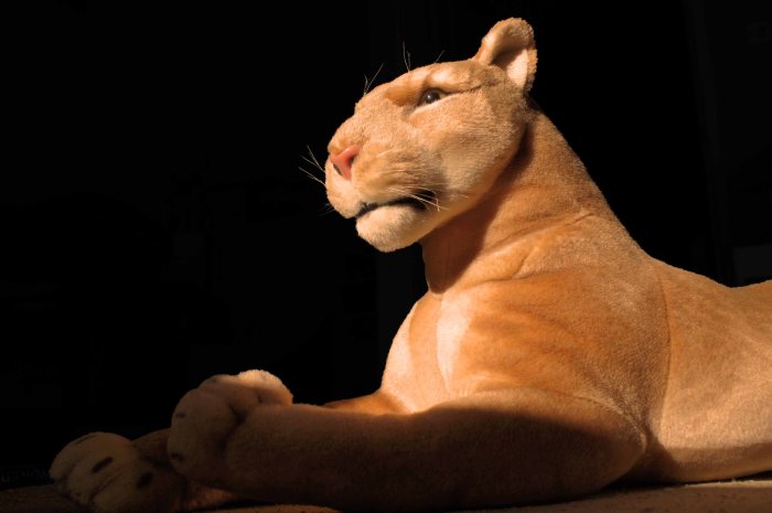
So after viewing the images for the stuffed toy lion I could see that the measured image is exactly as I expected it to be, the background showing some detail with the lion in perfect lighting. There are other images that I feel are usable but there is only the 1 image that I feel is the image that I wanted and would use and that is the image is the one that is 1 stop darker, I like that image because you cannot see the background very well the lion has a nice colour to it I also feel that if there was an orange hint top the light the background darkened down some more it could look like a sunset image on the lion. Because I was thinking about the image while writing the comments above I had to just go and do the image to how I wanted it to appear.
lion reworked
So after taking the one stop darker image I put it into Photoshop and then placed an orange filter over the image so as to give a more sunset look to the light and then took the brightness out of the background and increased the contrast to darken out the background.
Right now to carry on with the exercise.
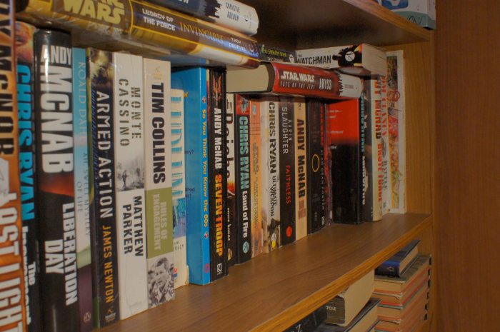
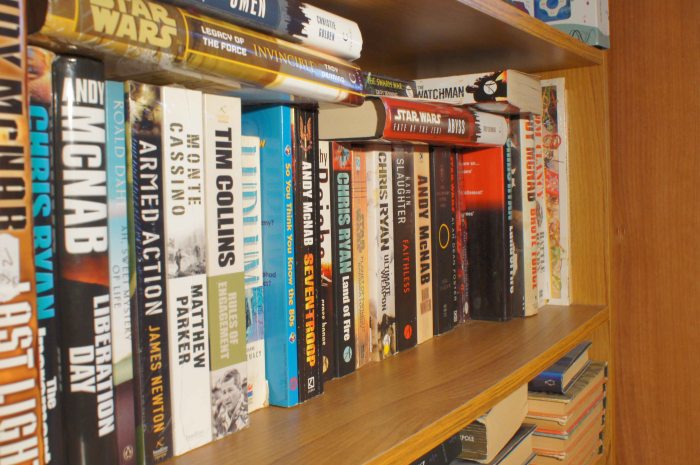
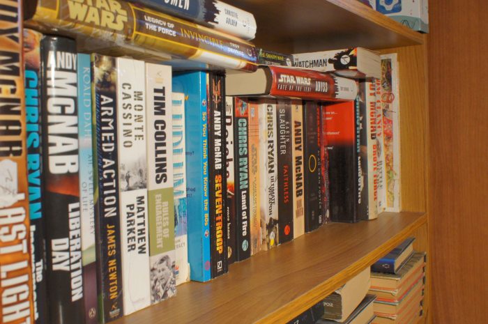
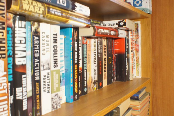
So for my second set of images of things from around the home I came across one of the bookshelves around the house and this is what I came up with.

1 stop darker books
1 stop darker.

half stop lighter books
Half stop darker.

measured books
Measured shot.

half stop lighter books
Half stop lighter shot.

1 stop lighter books
One stop lighter.

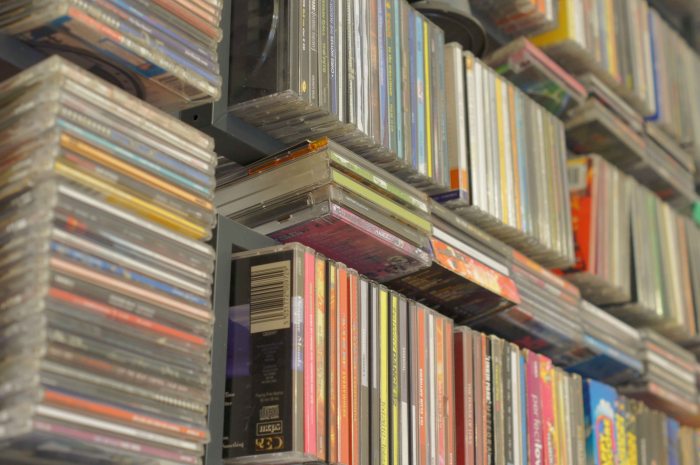
So with this set the measured shot is what I was hoping for the colours are right the light is right so exactly what you should expect from a measured shot. The only other shot that I would think about using is the half a stop darker image as this is very close to how I wanted the image to appear. I found that the lighter images are a little too light for there is a bit of light reflection on one of the books and it just ruins it as it burns out the colour the lighter the image goes.
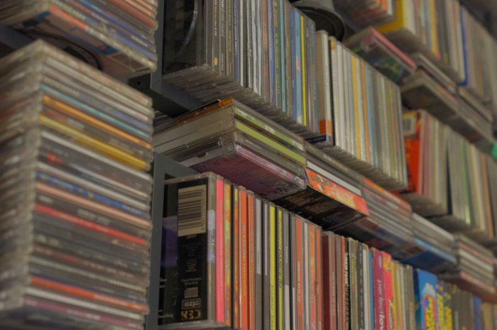
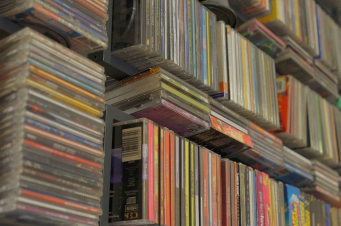
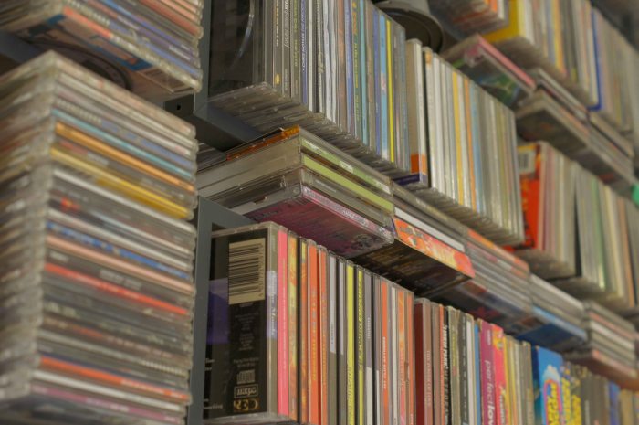
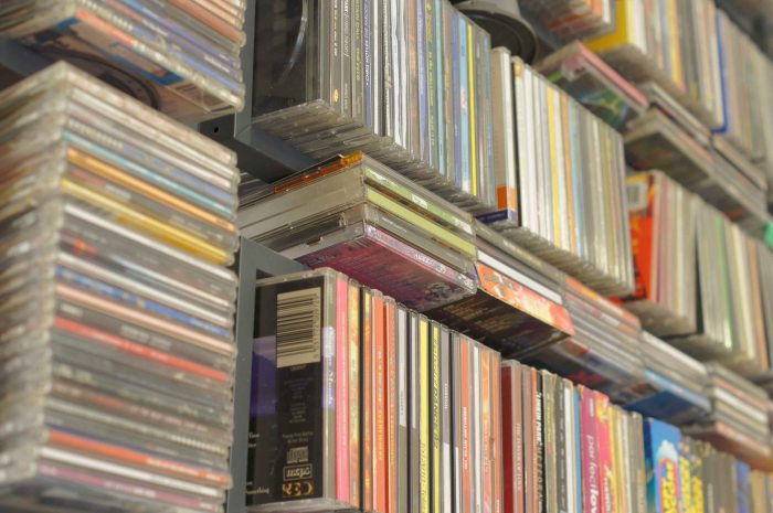
I am now going to do some shots of cd storage that I have containing a few of my hundreds of cd’s that I have. I am kind of doing the same thing with the cd’s as I have done with the books but the light is different in the area I keep a lot of my cd’s so the look should be a little different.
1 stop darker cds
One stop darker
half stop dark cds
Half a stop darker.
measured cds
Measured shot.
half stop lighter cds
Half a stop lighter.
1 stop lighter cds
One stop lighter image.
When going through the images of the cd’s I can see the measured shot is as it should be and is a nice enough shot but it is the half stop lighter image that I prefer. I find that the one stop lighter image is to light but with the half stop lighter image I find that the colour is very clear and bright adding that little bit more to it than what the measured image has.

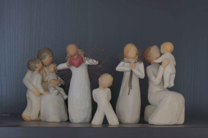
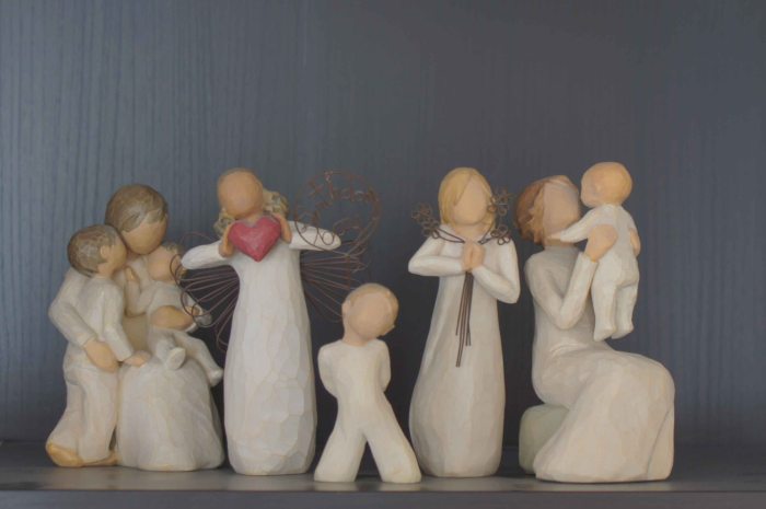
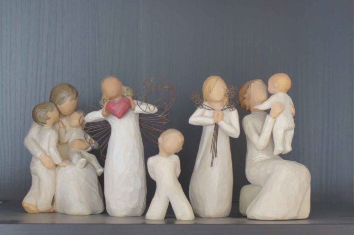
Now that I have done a toy, books and compact discs I have now got to think what else I can take some images of so let’s go for some willow tree ornaments but which ones to choose?
Well let us see what ornaments that I have chosen for my next series of images.
1 stop darker willow
One stop darker.

half stop darker willow

half a stop darker.
measured willow
Measured shot.
half stop lighter willow
Half a stop lighter.
1 stop lighter willow
One stop lighter image.
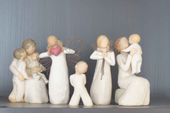
With this set of images I found that the measured shot is a nice shot as it is technically spot on for what I was after. What I was surprised about is that I there were other images that I found worked just as well such as the half stop darker and also the half stop lighter shot also worked. So out of the three images that I liked I found that if that if you needed the shot then you could use any of the three images.
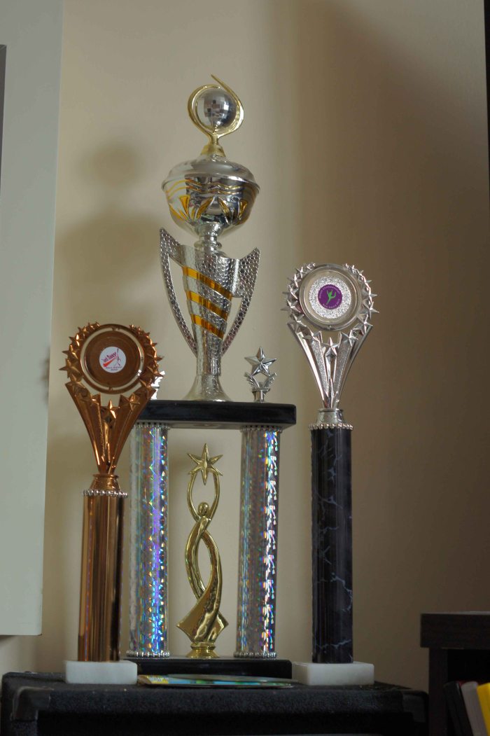
Now for the final series of images trophies.
1 stop darker trophies
One stop darker image
half stop darker trophies
Half a stop darker image.
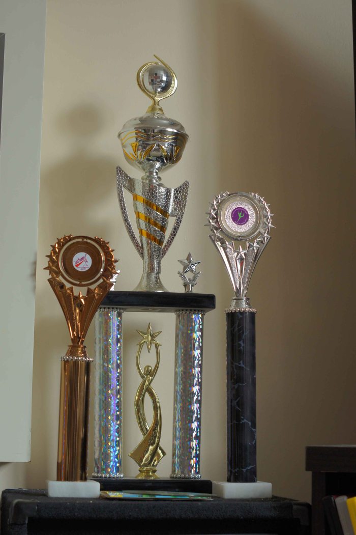
measured trophies
Measured shot image.
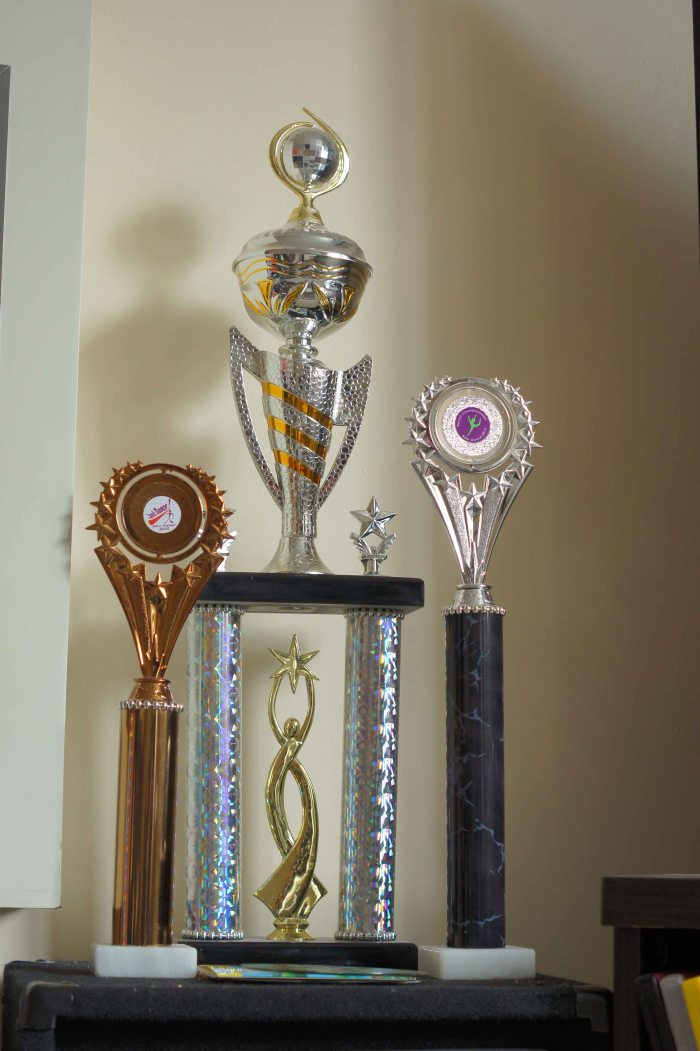
half stop lighter trophies
Half a stop lighter image.
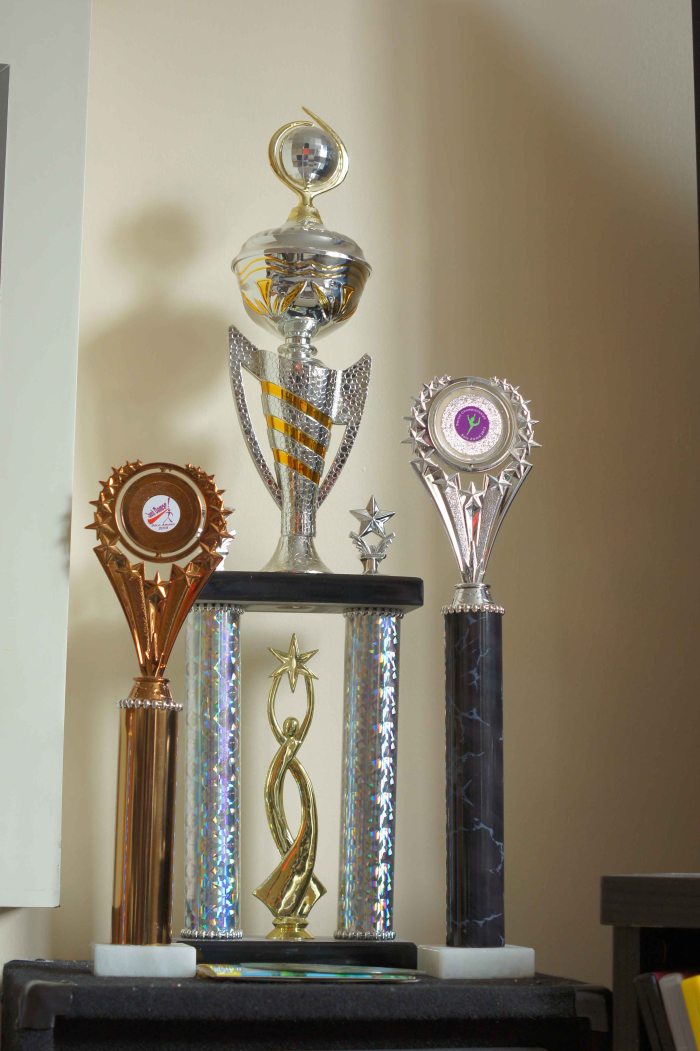
1 stop lighter trophies
One stop lighter image.
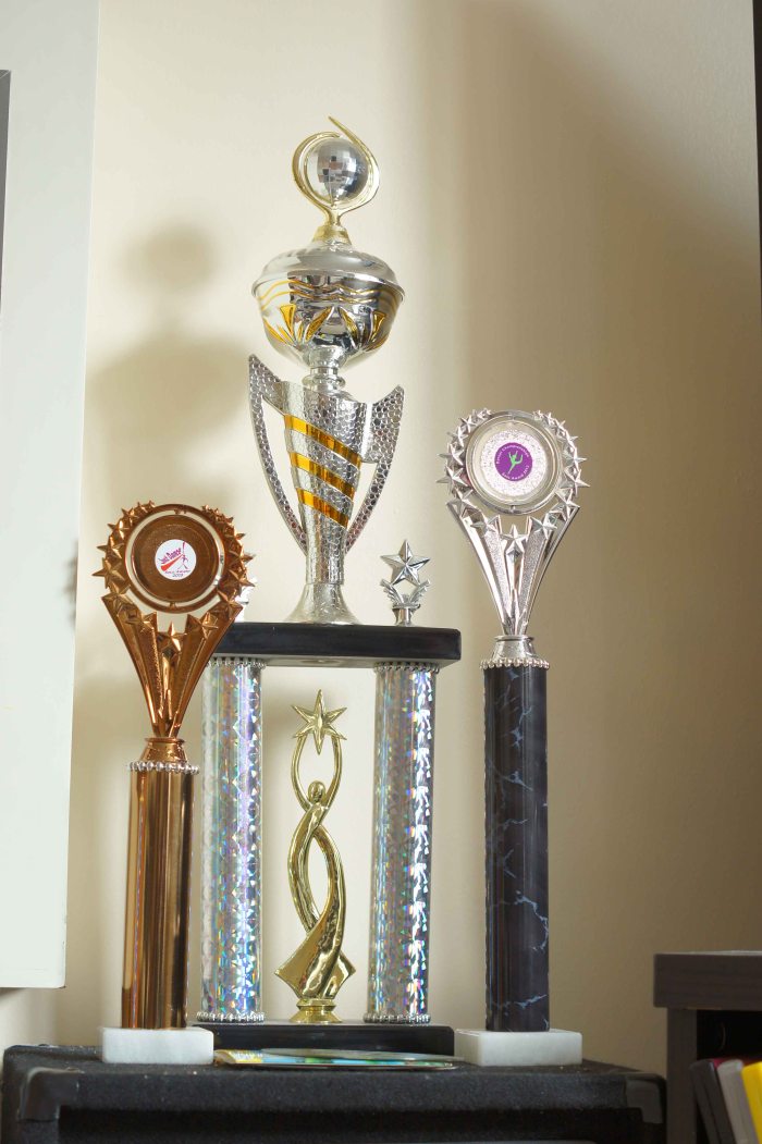
With this final set of images I found that due to the light the measured shot was as it should be but I did not like it. After going through all of the images I find that it is the 1 stop lighter image that I do prefer out of the set as it has a nice amount of light to reflecting off the trophies making them look a lot more sparkling than the measured shot.

So after looking at all of the sets I can see that the measured image are not always the best image for what I could be looking for which means that sometimes it may be advisable to bracket the images so as to get the image required.

Art Exhibition at Salisbury Hospital

I have just entered into an art exhibition at my local main Hospital.

Using all of the parts of the course that I have done so far and looked at, I set out to give them something different from work I have previously entered into this open exhibition but I am pleased to say that out of the 2 pieces entered 1 was accepted into the exhibition so I can now say that in the last 3 years I have managed to have work entered into the open exhibition.

So very happy with that.

A quick think about light.

What do I know about light?

With this topic on light i am not sure what i should expect to do after the topic of colour so we will see how it goes. What I think that I know about light is that we need light in photography to help make the image with out it we would have a just a plain photo paper or a black digital image. I know that we can take pictures in low level light too by adjusting the settings on the camera, we could adjust the shutter speed, the aperture and or change the ISO to a higher speed. (ISO measures the light sensitivity of the cameras sensor). I always try to use an ISO of 100 as this is seen as the norm, sometimes however because the light is not as bright being indoors or somewhere else that is shaded then i will increase the ISO but i don’t like going to high as the higher the number then the more noise you see in the image (the colours are not as smooth). So I try and keep the ISO below 800, the camera I have has an ISO of 100, 200, 400, 800, 1600, 3200, 6400, 12800. I do have to admit that i do like working in low light levels because it is more of a challenge to get the image that you want, by playing with the settings that it is how we learn to get the shots that we want.

I know that there are different forms of light for instance there is natural light such as the sun light. There is artificial light, this is man made light such as fluorescent light tubes and incandescent light bulbs. these artificial lights are found in the way of street lights, house lights, studio lights and lights used in a lot of business place’s. Daylight can vary to in the way in which the amount of light we see, if it is a cloudy day we don’t have as much light as we would on a clear day, if it is clear or cloudy the light can still vary from where you take your image as in if you are out in the open you would have more light than if you are the shadow of a building or under some trees, these are all factors to bare in mind about the light.

So as I am finding there is a lot to this topic in what is involved about light. After reading the first part of this topic i am glad to to see that i am heading in the right direction and that i am putting more of my thoughts down on this log, I hope it continues. I was surprised to read that when the sun reaches 40 Degrees in the sky from the horizon it is at its brightest till it goes back past that angle when setting.

I have also had a look at my camera to see what metering modes I have on it and found that I have a Multi segment mode which is like matrix or smart predictive modes on other cameras, I also have centre weighted and spot metering. with multi segment it takes light readings from different areas of the view and tries to give a balance of light to the light and dark areas in the view. With spot metering it focuses on the light in the spot, with centre weighted it is very close to that of multi segment metering.

Tutor Feedback

I have got my tutor feedback and I have to admit that I am very happy with the comments that I received. I thought that I had got it all wrong for a while but no it was good in the end.

It’s nice to receive comments that say:

“As already mentioned, your images are generally good technically (It’s good to see you recognise the imbalance of proportions of orange and blue in your first image). They use standard treatments – good exposure, framing, composition focus etc. and they all illustrate the topic well. But as intimated, some images show more originality and creativity than others. These tend to be the more abstract images.”

“The laser light image is your most abstract and imaginative image and is remarkable as a result. You have made it pay off with your choice of shutter speed and composition.”

It made me feel a lot better about what I am doing and that I do have my head in the right area for the topic.

There was a comment about how the images fitted the brief of the assignment but there was no theme to the set of images. The reason that there was no main theme was that I wanted to try and show that colours are everywhere and we can use them to our advantage or if we cannot find what we would like to find, it is easy to set something up as it was with my laser light image.

My tutor also said that some images might be better in slightly different crop of the image but one of these images was the sunset over the bay, the tutor showed a letterbox crop of the image but after looking at it I had to prefer my crop because I loved the colour cast over the rocks in the foreground. With all images people see and like different things so I can be honest and say that I think that people would like both edits. There was also positioning of the tulip in the image I went for a dead centre image I know that I could have gone and put the tulip to the edge of the frame, like I crop my tutor had done which was nice but also my tutor said about doing a bird’s eye view of this image, this I could not do unless I was in a helicopter as the tulip was on the side of the cliff but I understand what was meant by this and I do feel that the shot would also look good just not do able in this case.

I know that I have got to work harder on my log and I hope that you all can see a difference in the log over the next topic of light.


Assignment 3 Colours.

In this assignment it is set out to show that we have command over colour within the image in photography. That we are able to use and find different colours in deliberate relationships. There were 4 areas to look at and work in for this assignment, there is complementary colours, similar colours, and contrasting colours and then colour accent (spot) whilst keeping the image together. With complementary colours it was about using colours that complement each other and these colours are found facing each other in the colour circle such as blue and orange or red and green. Then we have similar colours like red, orange and yellow these colours are found next to each other and can be class as warm colours so with similar colours there can tend to be a warm range and a cool range in colour. Contrasting colours these are colours that do not blend well together but when used right can have a very strong contrast which leads to the image to be very eye catching and draws your attention to it. These colours are spaced a third of the way around the colour circle such colours as blue and red. For a colour accent or spot, is when you have a small area of a colour sat in and against a much larger background colour so as to appear as a spot or accent of colour within the image.

I do have to admit after taking pictures for quite a while I found this assignment the hardest 1 of all. I don’t know why but I found it hard to see it the way it was described, sometimes but hopefully after going through the course materials over and over especially when my computer crashed and I lost some of my work I was able to start a fresh and look at it from a little bit of a different angle.

In the range of images that I have done for this assignment they come from a range of still life, landscapes, macro shots and those moments when you are glad you have your camera with you because you never know if it would happen again. So I needed 4 images for each of the 4 colour relationships making a total of 16 images, here they are.

Colour Harmony through Complementary colours.

The four images for this topic are.

  •      The blue sky with the orange brickwork of an old collage.
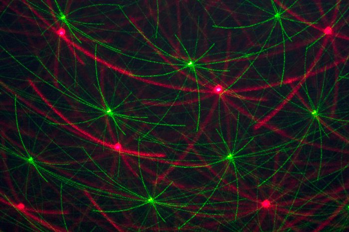
  •      Red and green laser movement.
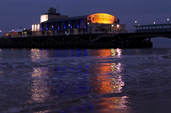
  •      Orange and blue pier lights and reflections
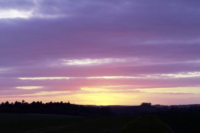
  •      Yellow and violet coloured sunset.

blue and orange

With the image of the old collage I had in my note book that I needed blue and orange but had forgot to put the amount of each that was needed so I ended up with more orange than I would have liked to have had, but to crop the image so as to give the values I would like, would leave the image in an unpleasing image that is why I left this as it is.

lasers

The red and green lasers this was the easy one, once I had found something a little different from any other images that I have seen. So using a disco laser light system I have I was able to slow the lasers down then making sure I had a  50-50 split in the view finder I than did a slow shutter speed of a second whilst being hand held to grab the light trails of the laser.

SONY DSC

The image of the Bournemouth pier lights was my correction to the last blue and orange. I went to Bournemouth to see some family and went for a walk along the beach, this is when I looked over at the pier and saw the way in which the lights lit up the pier but also their reflections across the water towards me. I did double check the white balance on the camera to make sure I had it right, which I feel I did as the street lights on the pier are white which is how they appeared to look instead of the orange glow that you often see with night street photography.

SONY DSC

The last image in this set the yellow and violet sunset was a by chance shot, out walking the dog I noticed that the sun was setting so just looking up saw that the sun had almost gone but was leaving me this lovely sunset with the darkish clouds and the last bit of the sun showing through on the horizon. I also tried to get the right value of 1:3 yellow: green.

Colour harmony through similar colours.

The four images I have used in this area are.

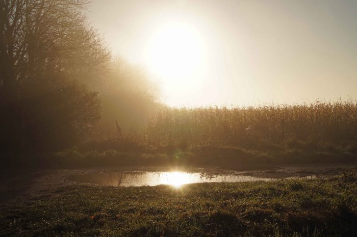
  •      A misty sunrise on an early misty morning.
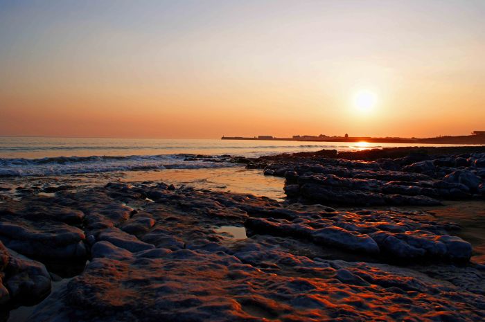
  •      Another sunset this time over a bay.
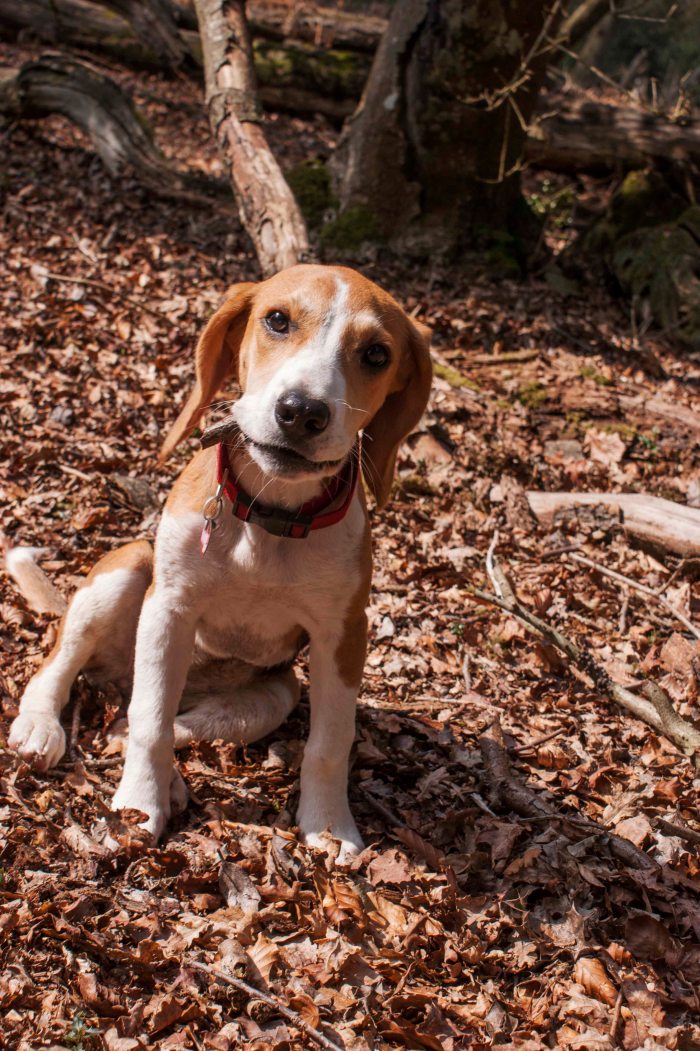
  •      A puppy in the new forest.
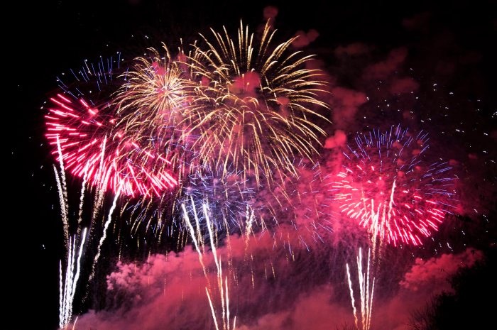
  •      The ending of a fireworks display.

SONY DSC

A misty sunrise I chose to use this image because of where the colour is so similar through the whole image the main colour is a light orange colour hinting to the yellow and a bit of brown.

SONY DSC

Sunset over the bay this image is chosen quite simply because of the orange glow that is cast over everything as the sun was setting so pretty much everything has an orange tint making all the colours blend together.

puppy

A puppy this is my beagle and a naughty girl she is! I loved this image in the new forest with all of the dead leaf litter (brown colours) the tricolour of the puppy and chewing on the little bit of stick. The colours all blend together so well, being that it is mainly the brown colours all the way through.

SONY DSC

The ending of a fireworks display this image I chose because of all the warm colours that are in there plus when you see fireworks a lot of people will think of the bonfire and keeping nice and warm next to it.

Colour contrast through contrasting colours.

Four images I have chosen are.

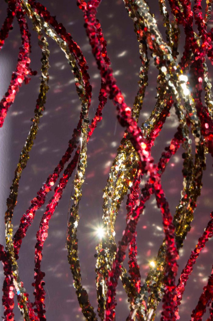
  •      Red and yellow sticks.
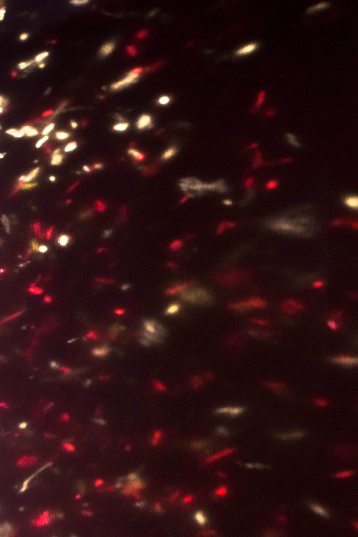
  •      Red and yellow reflections.
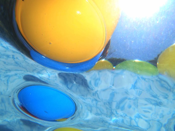
  •      Blue and yellow balls underwater.
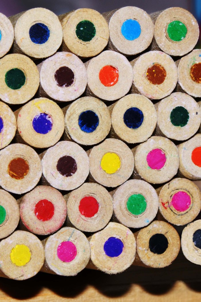
  •      Colouring pencils.

SONY DSC

In the red and yellow sticks image, I was out to capture that contrast of the red and yellow and show how it can work together to make something that is pleasing to look at but also is used very often especially at Christmas time. I felt that with the waviness of the sticks it brings movement to the image.

SONY DSC

Red and yellow reflections was just a little something I saw in the background so after moving around a little I used a darker wall and got the image of the sparkle reflections on the wall. I did notice that the yellow mainly appears at the top and the red mainly at the bottom but I feel that this adds to the fact that these two colours are a contrast of each other and is something different.

OLYMPUS DIGITAL CAMERA

Blue and yellow balls taken underwater again I wanted the image to be different it was the first time I had tried underwater photography and was only using a compact camera instead of my DSLR. I had to admit I was impressed with how the compact camera did and felt that the images were as good as they could be. In this image I just liked the way in which it all looked underwater and how you can see the things on top of the water which were not in view under the water.

SONY DSC

Colouring pencils this image is an idea from an old photography magazine I had laying around in which they shined a light down some coloured straws to get a colour cast.  I thought that if I used a pack of colouring pencils and shined a bit of light at the ends then that would show off the colours giving a contrast of colours because of there being so many of them. I do feel that it did work and the pattern also helps by making you look across the entire image.

Colour accent using any of the above combinations.

These are my four images for an accent using any combination.

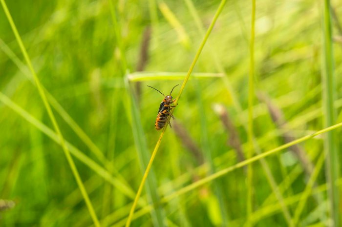
  •      A soldier bug in the meadows.
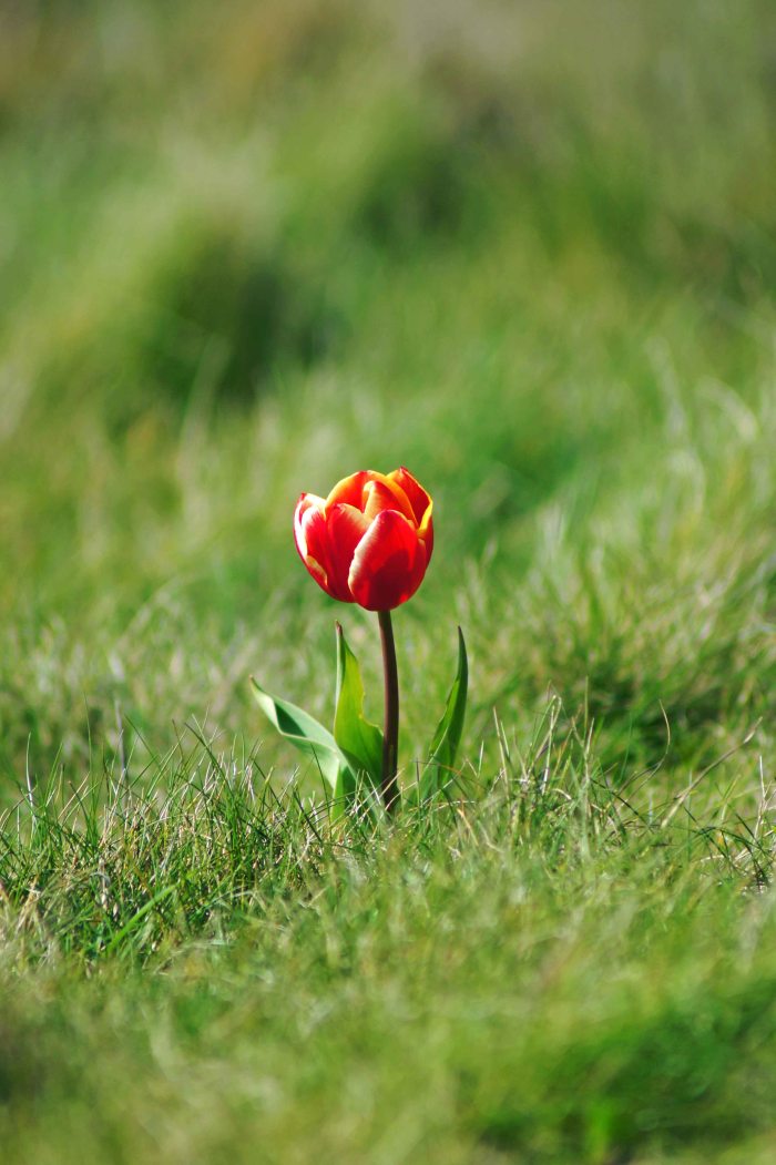
  •      A lone tulip on a cliff.
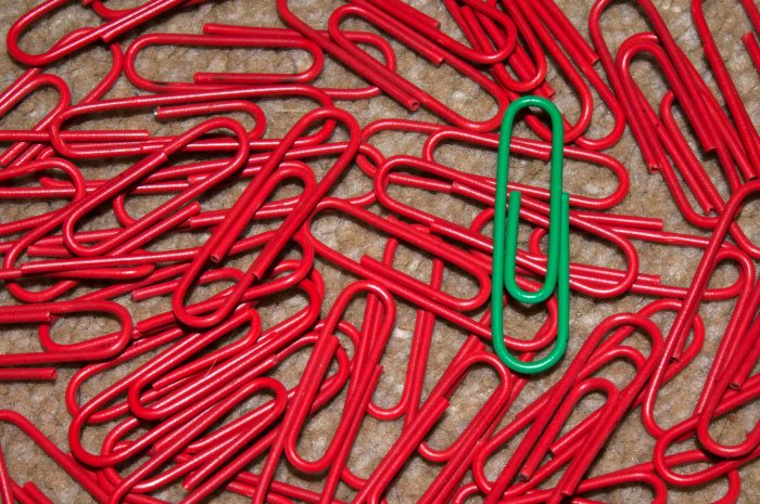
  •      An ill looking red paperclip!
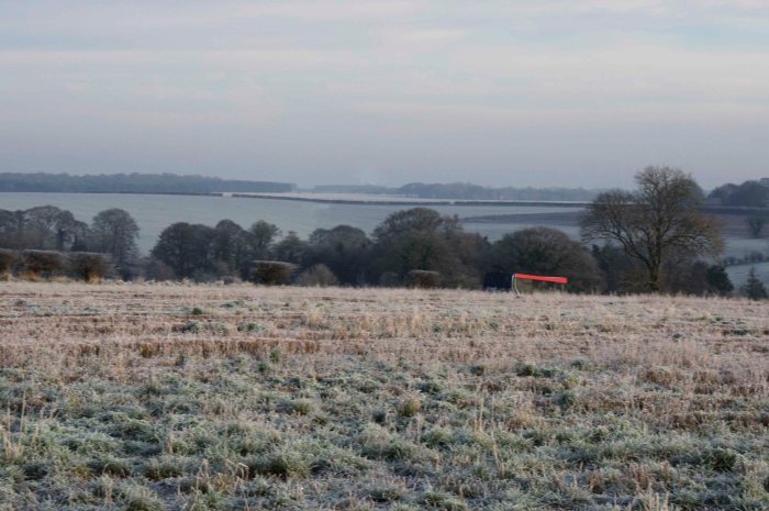
  •      Red bus in the countryside.

SONY DSC

Soldier bug in the long grasses of the meadow I wanted to include this image as it is one I think is spot on for this topic. I just love how this orange bug is sat on the long grass looking at the camera with all the green grass in the background and all of the diagonal lines just help this image to fit in together perfectly.

SONY DSC

The lone tulip I found sat all on its own on the side of a cliff face it was near the top on a steep slope just before the cliff face drops, it was a surprise to see it there but also intriguing to how it got there. It is also the way in which the red stands out from the green grass it just grips you and pulls you in.

SONY DSC

An ill looking paperclip, well a green paperclip amongst a sea of red paperclips, this idea came to me whilst staring at the pot of paperclips thinking what can I do for colour accent I then remembered an image from the course book showing a colour accent, it was green fields and the red roof of a building an aerial shot. That is when I noticed that were quite a lot of red paperclips but so many of the green and that was the deciding thought on what to do and the results I think are not too bad, when I look at the image I do have this feeling that a smaller green paperclip would have done better, I was just making do with what I had at hand.

SONY DSC

The red bus in the countryside this was a by chance moment I had stopped in a small layby on a busy road going through Salisbury plain, I stopped because I wanted to get a picture of the frozen fields across the plain, I had just taken a couple when I noticed the bus coming through the shot it was then I noticed the flash of the red and thought that is what I have been looking for my last shot for this assignment so twisting slightly managed to get this shot just before it dropped down the hill. So not the best landscape picture in the world but does fit the purpose of this assignment and I got cold doing it all part of the fun.

My conclusion.

I started off by not fully understanding what was ment by this topic and assignment in colour but now that I have reached the end of it I do feel that now I can understand how colours can add feeling to an image, also that with colour you can control it quite a lot in just the camera by just changing the speed or aperture to darken or lighten colours, then with white balance playing with it can add a blue or orange tint to your images. There is also the fact that adding filters to the camera or to the digital image through a photo editing software we can change the image. So it is important to know what it is you want to see in your images but also knowing how you want it to feel to yourself and your audience.

Colours into Tones in Black and White

This exercise was about making a still life image and turning it in to a black and white image but also using coloured filters to give us the understanding, putting colour to use in black and white images can give us a more powerful control, and to allow us to emphasis certain objects in a scene and suppress others.

So it is make a still life up take an image of it and then make 5 more with the use of Photoshop CS6 using the adjustments menu clicking black and white and then adding the filters that were needed for each one.

So I started off by finding a few objects that were of the 6 colours of the colour circle or as best I could, then set my scene up with the violet pony having lunch which was an orange, Sweetcorn, Cucumber and a strawberry yogurt. I then placed a mid gray card next to the set up so as to show it staying the same through the images.

This image is my original image and as it can be seen 1 little pony teddy having lunch in a big blue field.

So now that I have my image I shall now put it through Photoshop to convert to black and white.

With this image in black and white, you can see all is change it is quite a drab feeling it is like an image of “Eeyore” from the “Winnie the pooh” books all depressive and lonely.

With this image I used the red filter setting on the black and white conversion and as you can see it effected the image by whitening  out the red strawberry the orange and the sweetcorn and the gray card has stayed as a mid gray, the blue background has also become quite noisy.

Now with this image I used a yellow filter and noticed that i got almost the same sort of effects as i did with the red filter the main difference was that the background was smoother with thew yellow filter than with the red filter.

This image has a green filter applied to it and the effect it had was to give a nice colour to the cucumber and the back ground is not as noisy as the images before. The strawberry, orange and corn are a little bit lighter than the plain black and white image but I feel that the orange and the strawberry look better in this image and the gray card is still mid gray.

This image has the blue filter added and as it can be seen the changes are very noticeable. the background has gone to a light gray the cucumber, orange, corn and the strawberry have become very dark as well as the pony has become a little bit darker as well as the gray card has become a little darker.

So from doing this exercise it is possible to see how adding  filters when converting an image to a black and white image it is possible to highlight objects in the image but also by adjusting the level of  the colour filter added we can adjust the tone of the image so as to add feeling to an image.

Colour Relationships

I found this topic quite difficult but hopefully I got the right idea in the end.

so after long debate with myself thinking right so this is how it should be taking some images then reading about color relationships from the book  “THE PHOTOGRAPHERS EYE’ by Micheal Freeman, I feel as if i did ok .

I also wanted to try and make sure it was not the same sort of images that I felt would be used most commonly like flowers as these would give a natural color and could be placed to give the right color combinations. So here a couple of the combinations.

Here we have Red and Green combination which is split to give an even amount of red to green.

Then we have.

This shot of Blue and Orange was taken at the annual town fair from a side stall for the kids to catch a floating ball and win a prize, this took around 7 shots to get this as the balls kept moving and flying in to the air.

Now to produce some images that appeal to me and that I feel works and i will tell you why.

This image I love you have the blue sky with the green wheat and then there is the orange tops to the wheat. This image if going by the phrase i was taught when working with carpets this should not be acceptable as the phrase said blue and green should never be seen. But it works when you look at a lot of landscape images the main colors are blue and green and by having that little bit of orange in the image it helps in tying the image together. With this combination you get the feeling of peace, relaxed and all at ease.

With this image you have mainly the green with just a touch of red and yellow so color proportions are out the window but for me I feel that this does work with the green moss and leaves the red roses and then the small little yellow flowers, they seem to combine and balance the image.

This image was a night image on a 1 second shutter speed being handheld to give the angle i was after and thankfully everyone must have been stood still or were just moving very slowly. I love this image so much because of all the color that is in this image, there is Reds, Greens, Blues, Violets, Yellows, Oranges, Grays, Blacks and Whites. Also there is the fact that there is movement and stillness in the image too. I think that because of all of these aspects it gives balance to what should be an imbalanced image with so much going on.

This image I felt took the color proportions of blue and orange and turned them around and as can be seen it works, I would say that it is the rows of seating that go all the way down lining up with the stain glass window at the end that helps to add the balance to the image from the imbalance of the colors.

Sorry to all!

This is just a little message to say sorry as I have now fallen behind a bit and need to catch up.
I would like to say thank you to the insurance company its great to have a camera back.
So now to concentrate and get this topic done.